Exploring Dark Mode in Web Design: Does It Outshine Light Mode?
- August 28, 2024
- UI UX Design
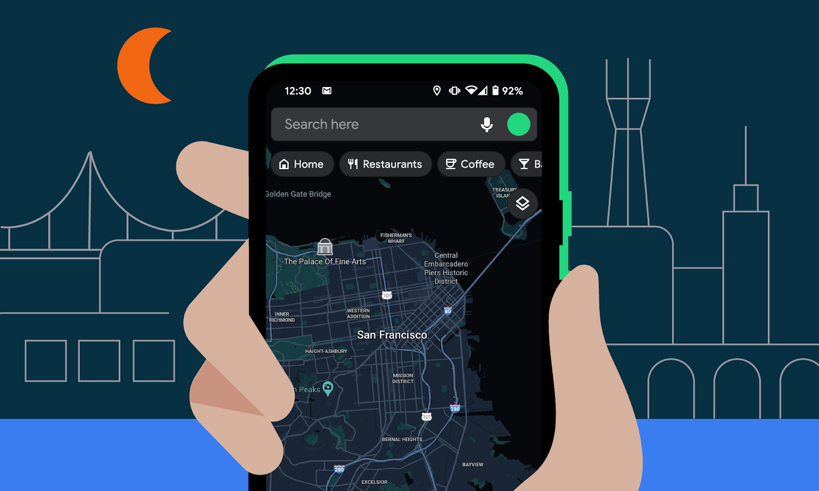
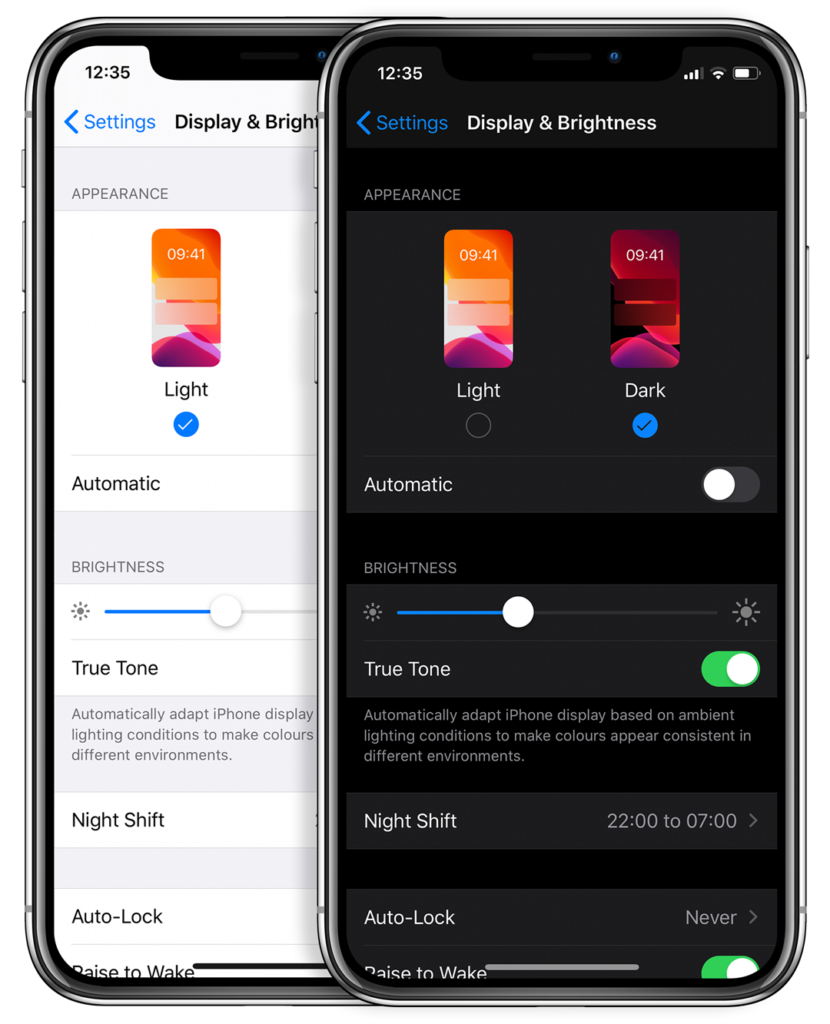
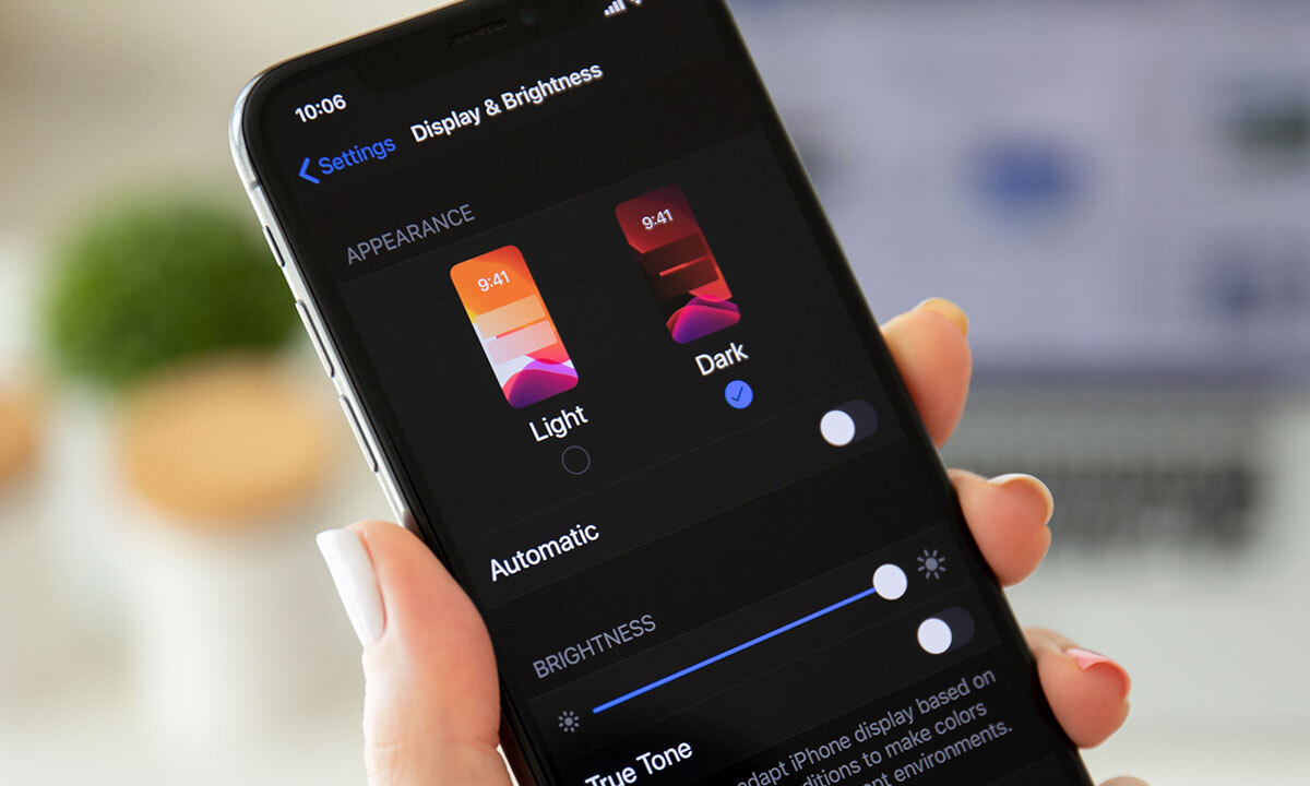
Dark mode has seen a steady rise in popularity over the past few years, particularly since Apple introduced the dark mode option in the iOS 13 update in 2019. Often referred to as “Night Mode,” “Shadow Mode,” or “Dark Display,” dark mode is a design term used to describe a low-light user interface that uses a dark color as the primary background, diverging from the default light design that has been the norm for decades.
In response to the increasing screen time users experience across devices, this trend in dark user interfaces has gained immense popularity. Major brands like Facebook, Google, WhatsApp, Instagram, and Apple were among the first to adopt dark mode interfaces, influencing many others to follow suit. However, operating systems, browsers, and apps aren’t the only places where dark mode continues to grow; more web developers and designers are beginning to embrace it, favoring dark UX/UI designs for their own reasons.
A “Comfortable” Website for the Eyes, in More Ways Than One
It’s no secret that the aesthetic of dark mode design can evoke strong emotions from visitors. Dark colors often convey a sense of sophistication, edge, and modern elegance to users. Black is a dominant color, frequently used to create maximum contrast when paired with white or vibrant colors. Dark colors are often associated with style and power, adding striking visual appeal and depth when used strategically as a website background. Dark mode is particularly beneficial for sites with lots of images and videos, where the dark contrast makes bright colors appear more vibrant and immediately grabs the audience’s attention. The more visually engaging the site experience is, the more likely visitors are to interact with the content and stay on the page.
More Than Just a Pretty Interface
Beyond being visually appealing, dark mode can actually be easier on the eyes. Some studies suggest that dark mode can help reduce the discomfort some people feel when looking at sites with light backgrounds. Dark mode is particularly favored in low-light conditions, where staring at bright white screens for long periods can lead to eye strain and fatigue. Reducing the pain associated with light-on-dark interfaces by switching to a dark display can encourage users to stay on your site longer.
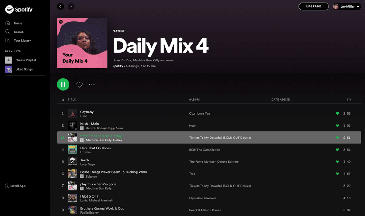
If you’re a Spotify user, your eyes (and ears) have been benefiting from dark mode features for years.
Dark Mode Can Save Both Mental and Electrical Energy
User experience research shows that dark backgrounds enhance page contrast, making images clearer and easier for users to focus on. If your site has a lot of images or focuses on visual or graphic content, dark mode will allow users to interact better and navigate through your site quickly and easily, enabling them to absorb more content faster and leave a stronger impression of what you offer.
Dark mode can also save battery life. Studies show that dark themes can significantly reduce battery usage, especially for users viewing your site on a mobile device. White pixels consume more power than dark pixels, allowing devices to use less energy. In an age where users are glued to their screens, anything that can save battery life is a win—and your site can be one of those things.