Designing Websites with a Mobile-First Approach: Best Practices
- August 28, 2024
- UI UX Design
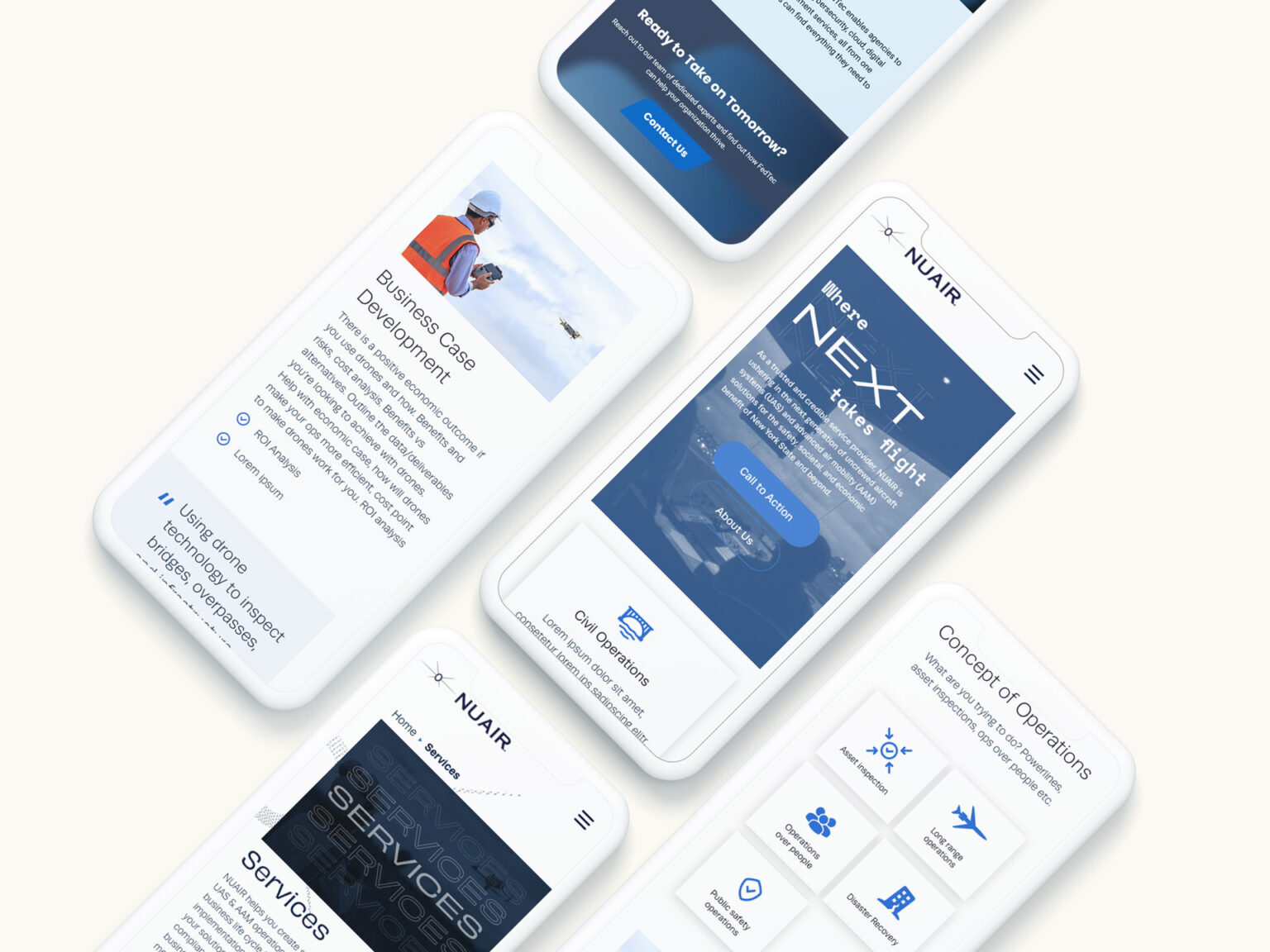
In today’s digital landscape, mobile traffic has surpassed desktop traffic and continues to grow significantly. As users increasingly rely on their smartphones for browsing, shopping, and entertainment, it has become crucial for businesses to prioritize mobile-first web design. At Niqat, we understand the importance of creating seamless and responsive mobile experiences that enhance customer satisfaction and boost conversions. Here, we share the best practices for designing mobile-first websites that can help your business thrive in this mobile-centric world.

Prioritizing Speed and Performance
Mobile users expect fast loading times. Even delays of a few seconds can lead to increased bounce rates and lost opportunities. To ensure your mobile site is fast and efficient:
- Optimize Images: Use compressed images without compromising quality. Consider using modern formats like WebP for better compression.
- Reduce HTTP Requests: Minimize the number of elements on your page to reduce loading time.
- Leverage Browser Caching: Store frequently used resources in the user’s browser to speed up repeat visits.
Simplifying Navigation
Mobile screens are smaller, and users often interact with them on the go. Simplified navigation helps create a seamless user experience:
- Design an Intuitive Menu: Use hamburger menus or bottom navigation bars to keep the UI clean and easy to navigate.
- Short and Descriptive Labels: Ensure menu items are clearly defined and concise.
- Clickable Areas: Make buttons and links large enough to be easily tapped, adhering to proper touch design principles.
Enhancing Touch Interactions
Touch interactions differ significantly from mouse clicks. Designing with touch in mind ensures better user engagement:
- Finger-Friendly Design: Ensure touch targets are at least 44×44 pixels to avoid accidental clicks.
- Gestures: Implement common gestures like swiping and pinching to improve navigation and usability.
- Feedback: Provide visual feedback for taps and gestures to ensure users’ actions are acknowledged.
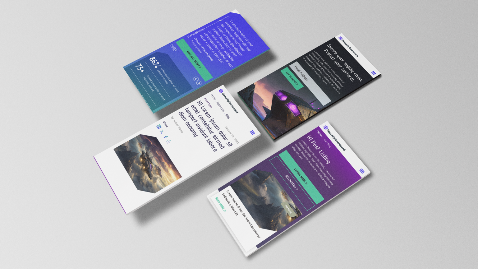
Responsive and Adaptive Design
Focusing on mobile doesn’t mean neglecting other devices. Your design should adapt smoothly across all screen sizes:
- Fluid Grids: Use percentage-based widths to allow content to resize smoothly.
- Flexible Images: Ensure images scale correctly without breaking the design.
- Media Queries: Use CSS media queries to apply different styles based on device characteristics.
Prioritizing Content
Mobile users often seek specific information quickly. Organize content to meet their needs efficiently:
- Important Information First: Place critical content and calls-to-action (CTAs) at the top of the page.
- Short, Readable Text: Use short paragraphs, bullet points, and headings to make text easy to read.
- Visual Hierarchy: Use size, color, and spacing to guide users to key elements.
Continuous Testing and Iteration
Ongoing testing and iteration are key to maintaining an effective mobile-first website:
- User Testing: Conduct regular usability tests to gather feedback from actual users.
- Analytics: Monitor user behavior and site performance using tools like Google Analytics.
- A/B Testing: Experiment with different design elements to see what works best for your audience.
Progressive Web Apps (PWAs)
Consider enhancing your mobile site with Progressive Web App features for an app-like experience:
- Offline Functionality: Allow users to access content even without an internet connection.
- Push Notifications: Engage users with timely updates and promotions.
- Home Screen Access: Enable users to add your site to their home screen for easy access.
Mobile-Friendly Forms
Forms are an essential part of websites, especially for lead generation and interaction. Ensuring they are mobile-friendly is crucial:
- Simplify Fields: Ask only for essential information to minimize user effort.
- Autofill and Autocorrect: Utilize browser features to help users quickly complete forms.
- Flexible Input Fields: Ensure fields are large enough and easy to tap, and they should adapt to different screen sizes.
Leveraging Mobile Device Features
Take advantage of the unique features of mobile devices to enhance user experience and functionality:
- Location Services: Use GPS to provide location-based services or content.
- Mobile Payments: Integrate mobile payment options like Apple Pay and Google Wallet for seamless transactions.
- Voice Search: Optimize for voice search to cater to users who prefer speaking over typing.
Focusing on Accessibility
Ensuring your mobile site is accessible to all users, including those with disabilities, not only expands your audience but also meets legal requirements:
- Alt Text for Images: Provide descriptive alt text for images.
- Keyboard Navigation: Ensure all interactive elements can be navigated using a keyboard.
- Screen Reader Compatibility: Use semantic HTML and ARIA roles to support screen readers.
